Sanctuary of Truth
A complete redesign of a cultural heritage museum’s website located in Thailand. focused on creating an intuitive, visually immersive interface that reflects the museum’s craftsmanship and cultural significance.
Overview
This project focused on the full redesign of a Thai cultural museum’s website to improve both usability and visual consistency. The original site suffered from fragmented design, inconsistent themes, outdated elements, and critical UX flaws such as non-functional links, poorly styled pop-ups, and missing or hard-to-find key information like the FAQ and ticket purchasing options.
One of the most glaring issues was the disconnect between the site's aesthetic and the rich cultural identity it aimed to represent. The outdated Thai font and mismatched design components detracted from the authenticity and elegance of the museum’s story. Navigational elements, including a redundant burger menu and unclear calls to action, further hampered the user experience.
The redesign addressed these issues by creating a unified visual language that respects the museum's cultural roots while introducing a modern, polished interface.
Problem
During the initial review of the website, several usability and visual design issues became apparent, affecting both the user experience and the brand’s online credibility.
Outdated Design & Inconsistency
The overall visual design feels outdated, with inconsistent themes across pages and the use of old Thai fonts that don’t reflect a modern or cultural aesthetic.Poor Usability & Navigation
Important features like ticket purchase and FAQs are hard to find or improperly labeled. Navigation elements (e.g., duplicated burger menu, broken links) make the site confusing and unreliable.Unclear Communication of Information
Key content (e.g., pop-ups, images, CTAs) lacks hierarchy and responsiveness, making it difficult for users to access or trust the most important information.
Goals
The redesign aims to modernize the site’s visual identity, enhance navigation for a smoother user journey, and improve content accessibility to build user trust and engagement while preserving the unique cultural essence of the museum.
Modernize the Visual Identity
Redesign the website with a consistent, contemporary aesthetic that blends traditional Thai culture with clean, modern UI practices.Enhance Navigation & Accessibility
Streamline the user journey by improving information architecture, fixing broken links, and making essential pages (like ticketing and FAQs) easily accessible.Improve User Engagement & Trust
Optimize CTAs, content layout, and overall responsiveness to ensure users can easily interact with the site, find what they need, and feel confident using it.
Research
To guide the redesign of the Sanctuary of Truth’s website, I conducted independent research focused on user needs, tourism website best practices, and UX/UI improvements relevant to cultural institutions.
Competitor Analysis
Studied websites of renowned cultural landmarks and museums (both local and international) to identify modern design patterns, ticketing flows, and information architecture strategies.UX/UI Heuristic Evaluation
Audited the existing site to identify key usability issues, such as unclear navigation, outdated interface elements, and accessibility limitations.Tourism Trends & User Behavior Review
Reviewed tourism data, traveler expectations, and multilingual accessibility standards to ensure the redesign would appeal to both Thai and international audiences.User Analysis
To design with empathy and purpose, I crafted foundational user persona that reflect real-world behaviors, frustrations, and expectations as well as user journey map.

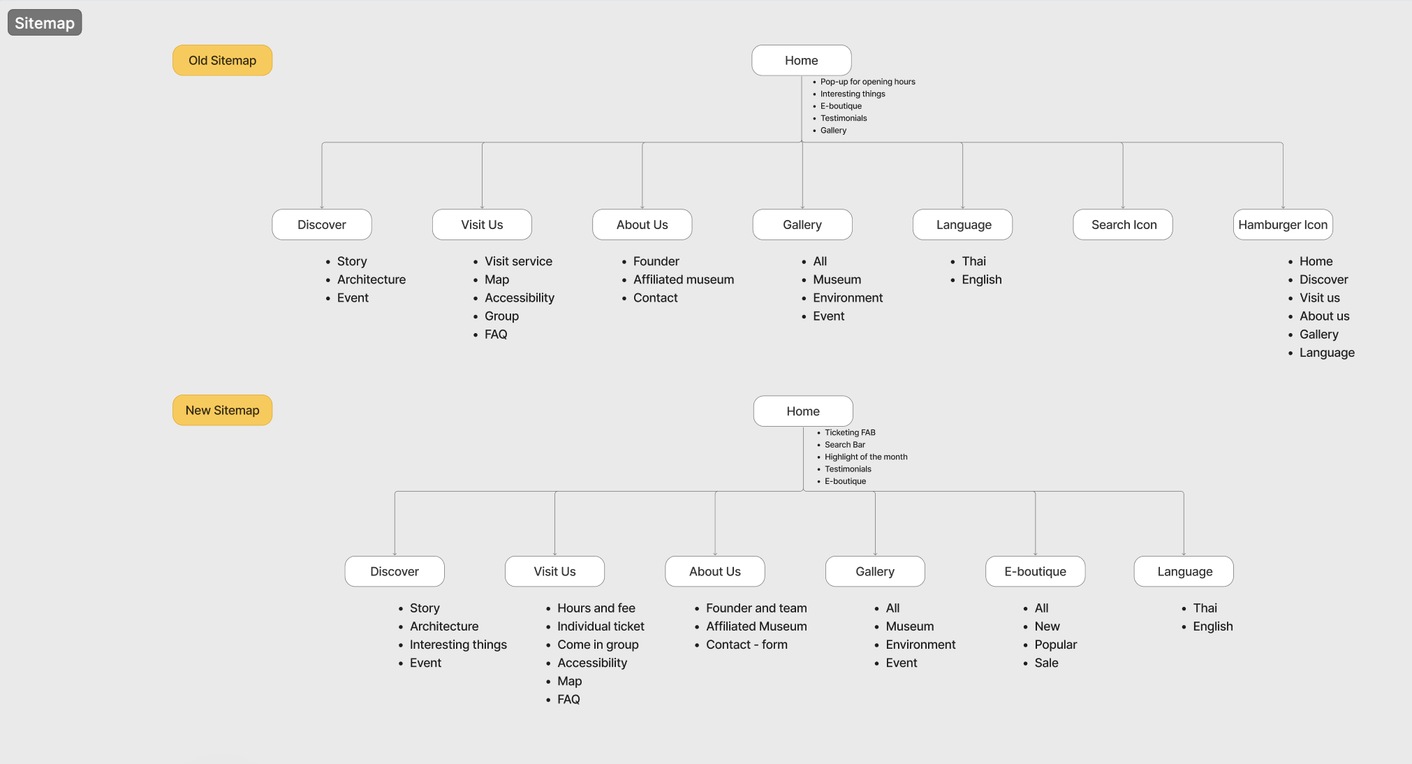
Restructuring for Clarity and Discoverability
To improve both user navigation and search visibility, I restructured the site’s information architecture with clarity and accessibility in mind. The updated sitemap prioritizes key user action such as discovering highlights, accessing visit information, and purchasing tickets within floating action button (FAB). I grouped culturally rich content under clear categories like “Discover,” while consolidating scattered pages and eliminating dead links. This not only modernizes the browsing experience but also ensures foreign visitors and locals alike can quickly find what they need, enhancing overall engagement and discoverability.
Brand Visual Guidelines and Design System
To elevate the Sanctuary of Truth’s online identity while preserving its cultural depth, the design system was crafted to merge traditional Thai aesthetics with modern usability.
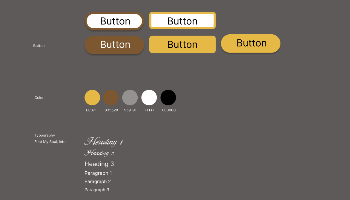
Typography
For headings and prominent text, I chose My Soul, a typeface that captures the elegant, handwritten character often seen in Thai artistic traditions. It adds a touch of personality and cultural depth, mirroring the sanctuary’s intricate wood carvings. For body copy and interface elements, I used Inter, a neutral, highly legible sans-serif font that ensures clarity and consistency across devices. This combination keeps the design both emotionally resonant and functionally modern.
Color Palette
The color palette draws from the sanctuary’s materials and symbolic roots:
Brown evokes the rich, natural wood the sanctuary is built from, grounding the design in authenticity.
Yellow-Orange signifies the historic wealth and spiritual richness of the city’s golden age.
Black, White, and Grey provide a clean, minimal base to support readability and give the interface a polished, contemporary feel.
Together, these visual elements form a design system that feels deeply rooted in Thai heritage while remaining accessible and engaging for a global audience.
Prototype
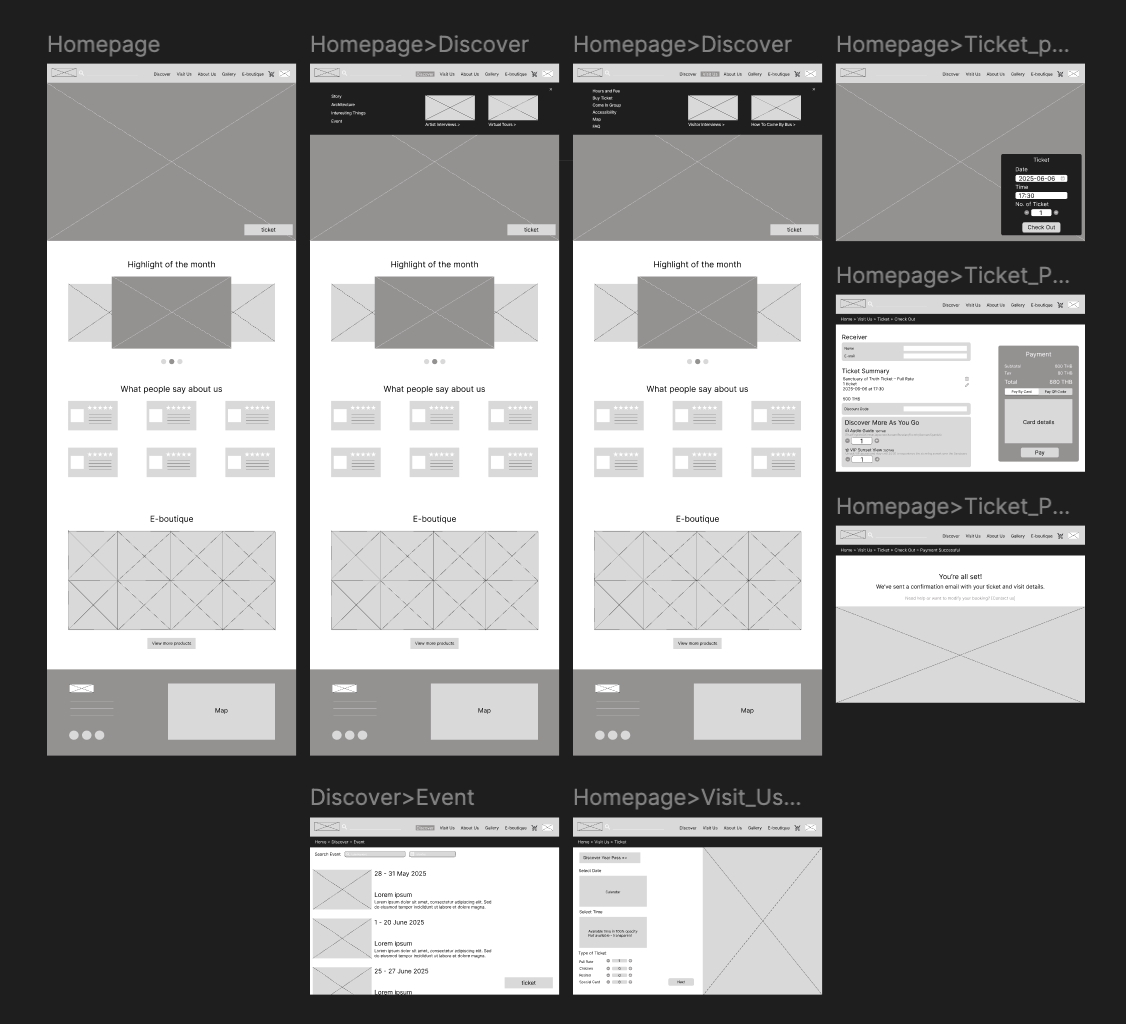
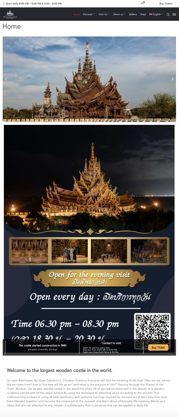
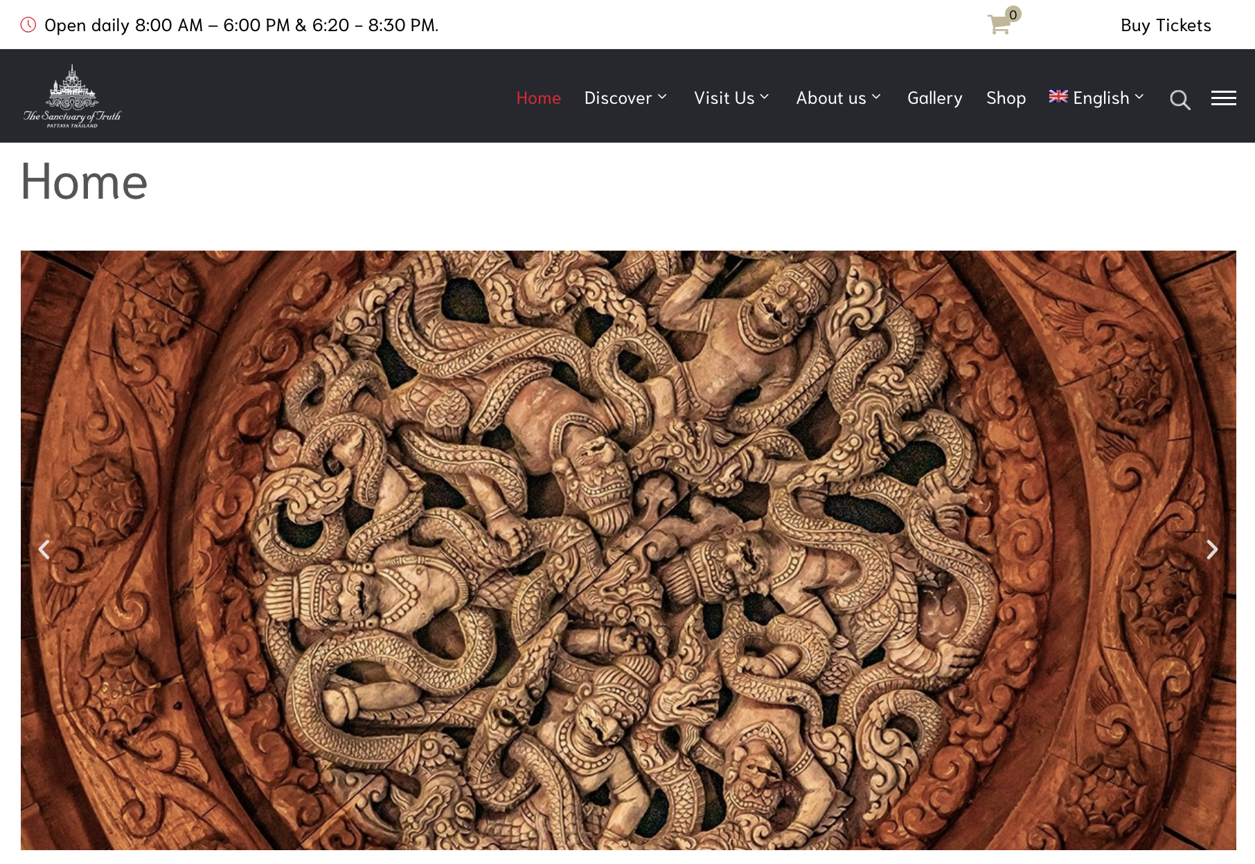
01 - I restructured the homepage to establish clarity, consistency, and a stronger first impression.
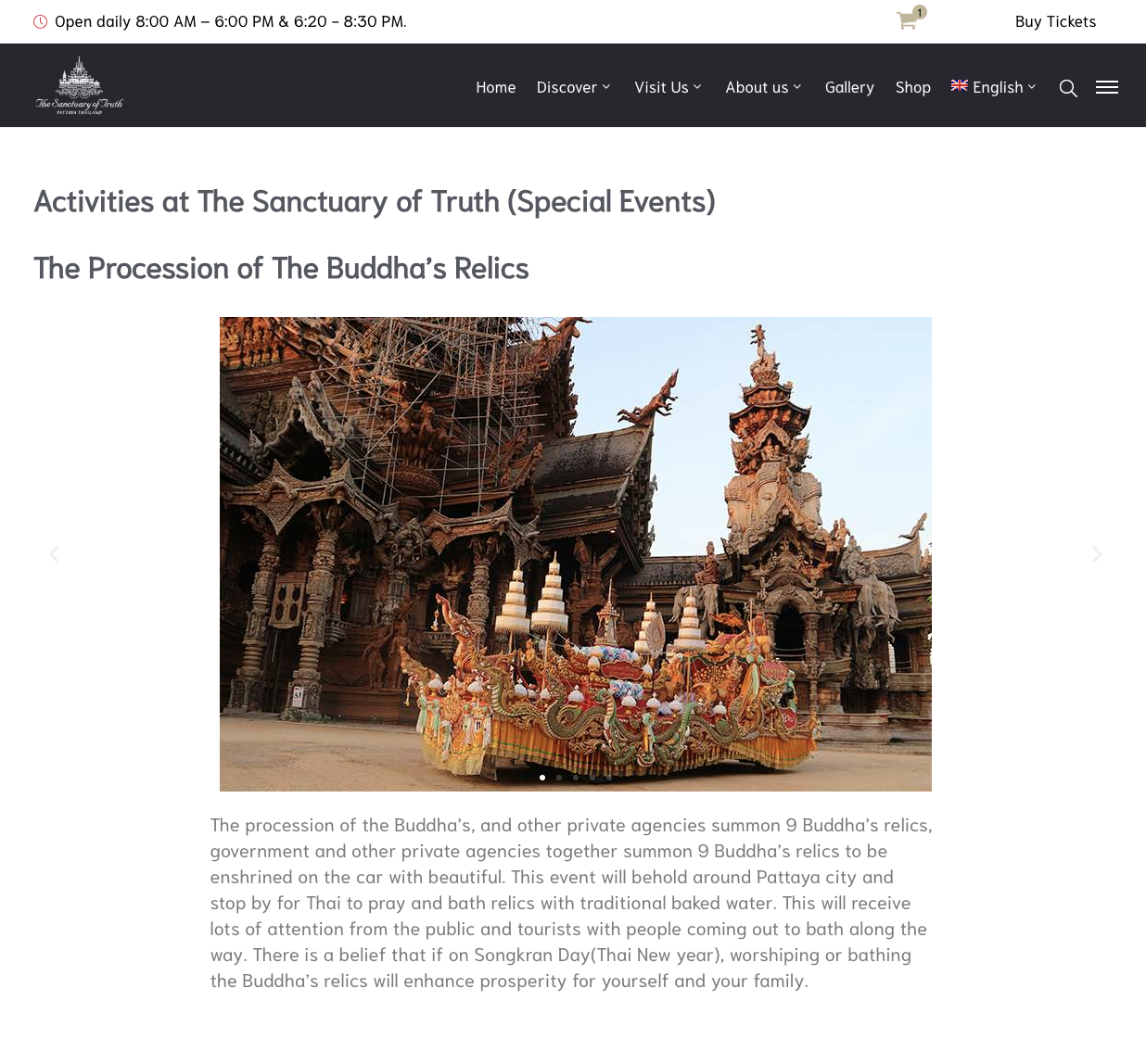
Before: The original homepage was cluttered, lacked visual hierarchy, and mixed unrelated content without clear sections. Important information like ticketing or visiting details was hard to find, making navigation frustrating for users.
Now: I designed a structured homepage with defined sections, headlines, and logical content flow. A clear hero area introduces the museum with engaging visuals and a succinct introduction. Non-essential or secondary content was moved further down or to internal pages to reduce noise and create a smoother, more intentional user journey.
before
after

02 - I redesigned the hover dropdown menu to be more sleek, engaging, and informative.
Before: The original dropdown under “Discover” was a plain white box with basic text links, making it easy to overlook and uninspiring to use.
Now: I introduced a visually refined hover dropdown with a modern layout, improved spacing, and subtle hover animations. I also added visual highlights for key topics such as featured stories and architectural elements to guide users’ attention and spark curiosity.
before


after
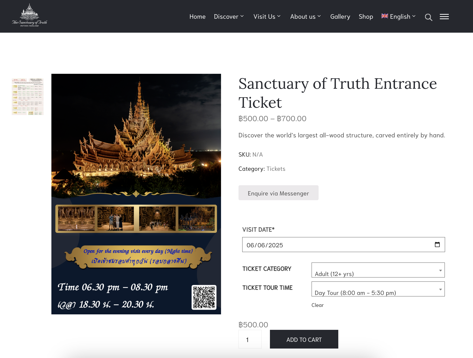
03 - I added a floating action button (FAB) for ticket purchasing to improve visibility, accessibility, and provide multiple entry points.
Before: The “Buy Ticket” option existed only as a static text link in the header, which could be overlooked and offered just one access point to the ticketing page.
Now: I introduced a floating action button that stays visible across the entire site, allowing users to purchase tickets at any moment. Additionally, I added a clear ticket purchase option within the “Visit Us” section. By creating multiple entry points, users now have greater flexibility and fewer barriers when taking action—ultimately streamlining the conversion process.
before

after
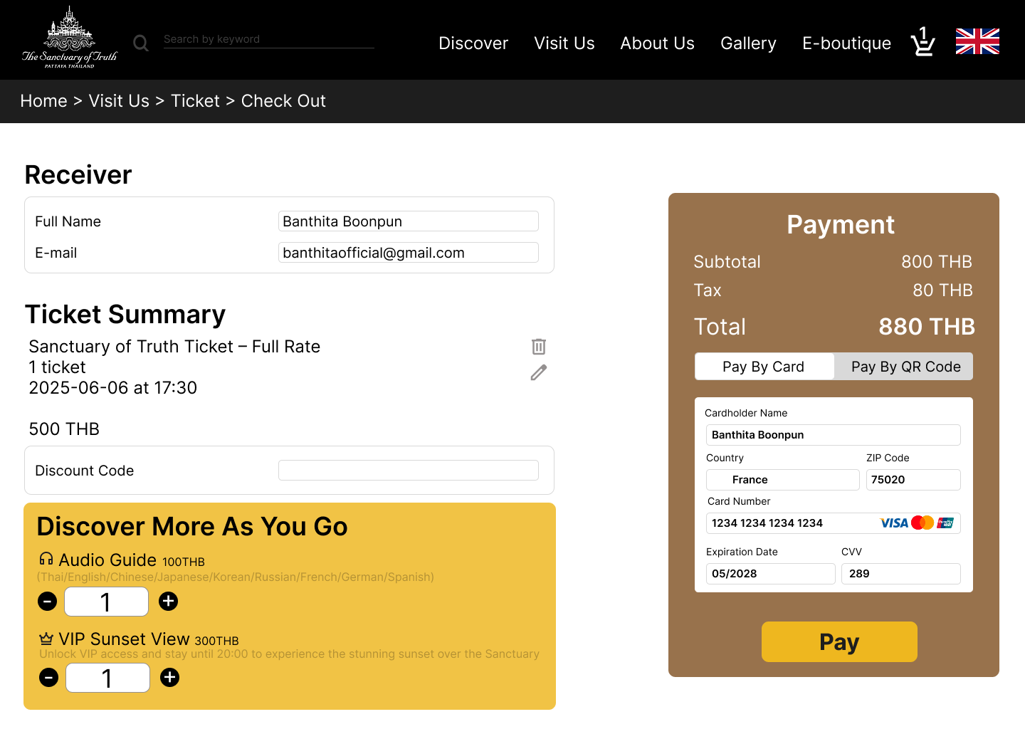
04 - I redesigned the checkout experience to feel more trustworthy and added upselling opportunities through optional add-ons.
Before: The original checkout page lacked structure and polish, which could undermine user trust during the payment process. It also didn’t offer any additional options to enhance the visitor experience.
Now: I created a cleaner, more systematic layout that instills confidence in users as they complete their purchase. I also introduced optional add-ons—such as an audio guide and VIP sunset access—to increase value for the user and drive additional revenue. These enhancements make the checkout process not only more seamless but also more strategic for both users and the business.
before


after
05 - I revamped the event page to improve scalability and user engagement through better structure and search functionality.
Before: The original event page was cluttered—just a mix of text and images with no clear hierarchy or standout details. There was no way to search or filter, and event dates were buried within the content, making it hard for users to plan ahead.
Now: I introduced a clean layout that highlights each event with clear visuals and date information. To support user goals, I added keyword and date-based search filters, helping visitors quickly discover events that match their interests. This improves usability and encourages ticket purchases by showcasing relevant experiences more effectively.
before
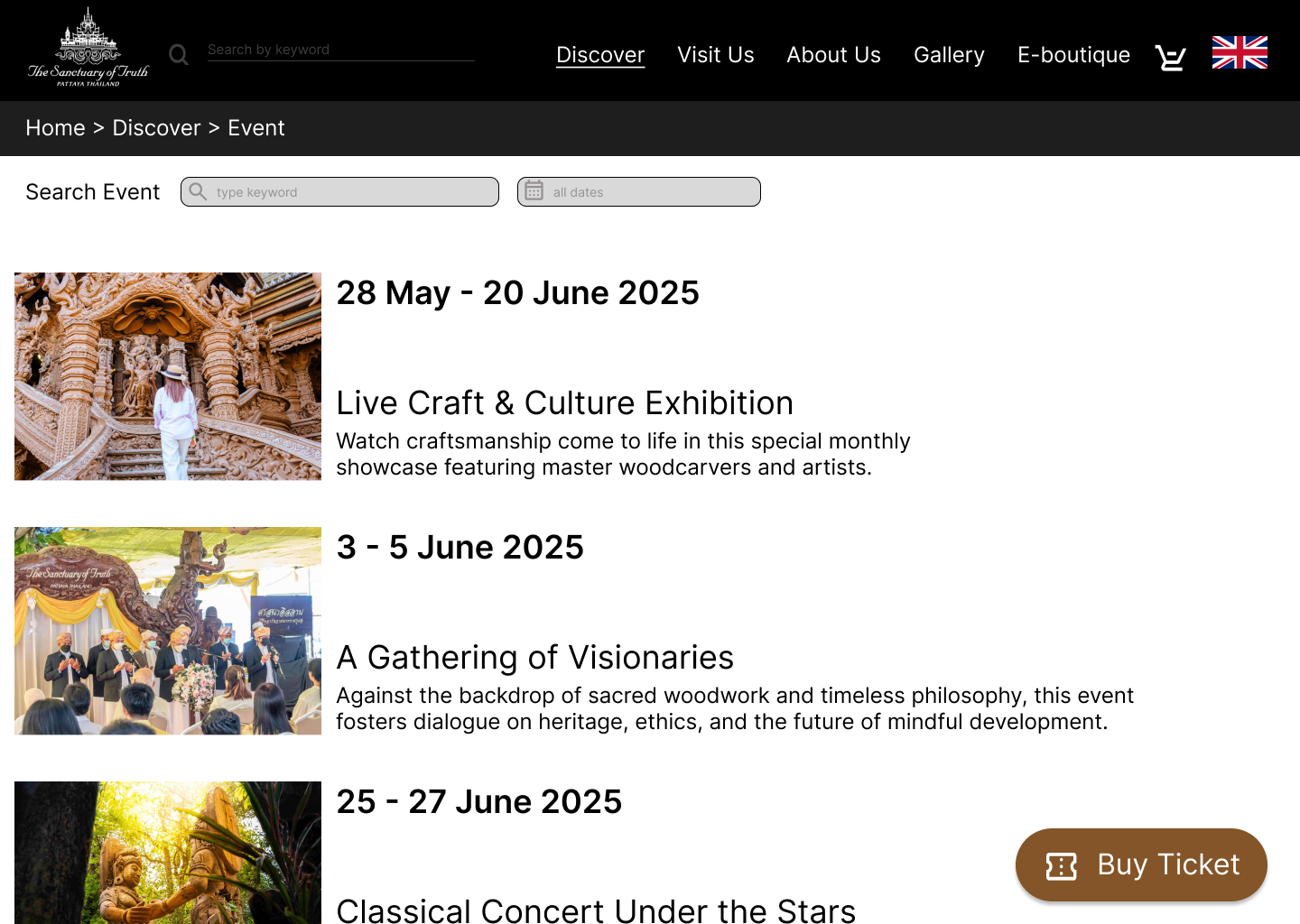
after
Key Takeaway
Discovered the power of upselling through thoughtful UI elements (e.g., add-ons at checkout).
Reinforced the value of accessibility and intuitive navigation to support a seamless user journey.
Developed a stronger understanding of how good design directly impacts user trust and engagement.
If I had more time, I’d explore motion design or micro-interactions to elevate user delight and guide attention subtly through transitions.